
PowerPoint has become the de facto standard at most conferences and most presentations. PowerPoint has some wonderful advantages but it also has some pitfalls for the novice.
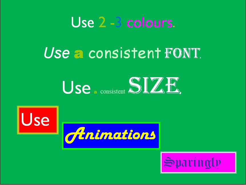
Too many colours, fonts, sizes and animations.
The temptation is to have too many slides and to overuse the special features, for example, fonts, colours, flying arrows etc. This has led to the terms:
Death by PowerPoint
and
Death by bullet point
So here are a few simple guidelines to help you use PowerPoint effectively.
Use standard templates
When people start using PowerPoint they can get carried away with all the possible colours, backgrounds and effects. This can lead to some very ugly combinations. There are people who spend many years learning how to use colours and how to lay out text and images. They are called graphic designers and they have prepared a wide range of templates that come standard with PowerPoint. My advice is that unless you’re a graphic designer, use some of the prepared templates. PowerPoint comes with a standard set of templates and backgrounds. You can also get other templates from the web, for example: http://office.microsoft.com/templates
Your organisation may have a standard template you are supposed to use. Use it. One of the advantages of standard templates is that generally the colours have been chosen so that you can read the text easily. This is one of the problems of creating your own templates. What looks OK on your laptop screen may not project very well.
The rule of 6×6
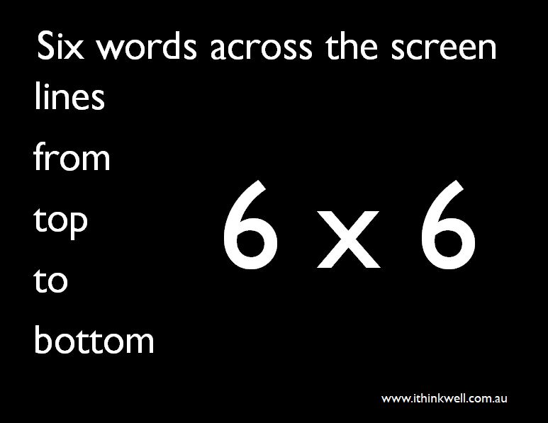 Six lines per screen and six words per line is a reasonable rule to follow. This forces you to think about what you put on the screen rather than just putting your whole script/paper there. It also means the writing will be large enough to be easily read. Obviously it’s just a guideline but it does give you a sense of how much information to include.
Use images and pictures
Newspapers would be very dull without some pictures to provide interest. Images and pictures add another dimension to your slides. However, they should be relevant to the topic.
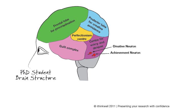
The PhD student’s brain.
When I’m talking about how a PhD student’s brain works I use the following image.
O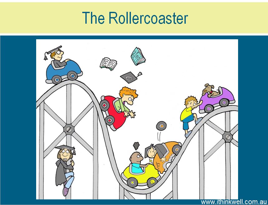 r when I’m talking about how the PhD experience can be like being on a roller-coaster I use this image.
Use charts and graphs to highlight
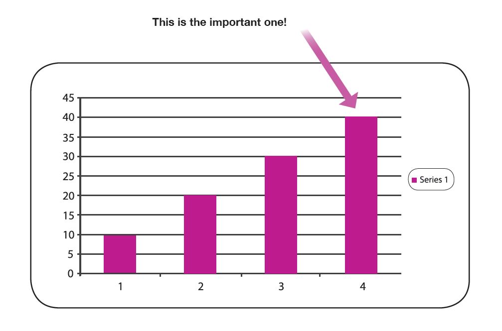 If you need to talk about a lot of numbers use charts and graphs to highlight points. Make sure you label the important points, for example, put an arrow pointing to the thing you want to highlight.
Number of slides
There are no absolute rules, but in general no more than one slide per minute (less if possible). Which means for a 20 minute talk probably no more than 20 slides. If you have more than this you are going to be rushed and probably have too much material. There may be exceptions, for example, if you are showing lots of pictures.
And finally “I know you can’t read this but …”
If they can’t read it then what’s the point? Just because you can scan in a page of text doesn’t mean you should put it on PowerPoint. The exception here is if you are showing what a form or graph looks like. To be legible the font size should be 18 points or higher.
Extract from Presenting your Research with Confidence, Hugh Kearns.
Hi Hugh,
This information was really helpful, thank you! I was wondering about what sorts of images are acceptable in academia? Do you recommend paying for a shutterstock account or other web page that has images?
Thanks,
Lucinda